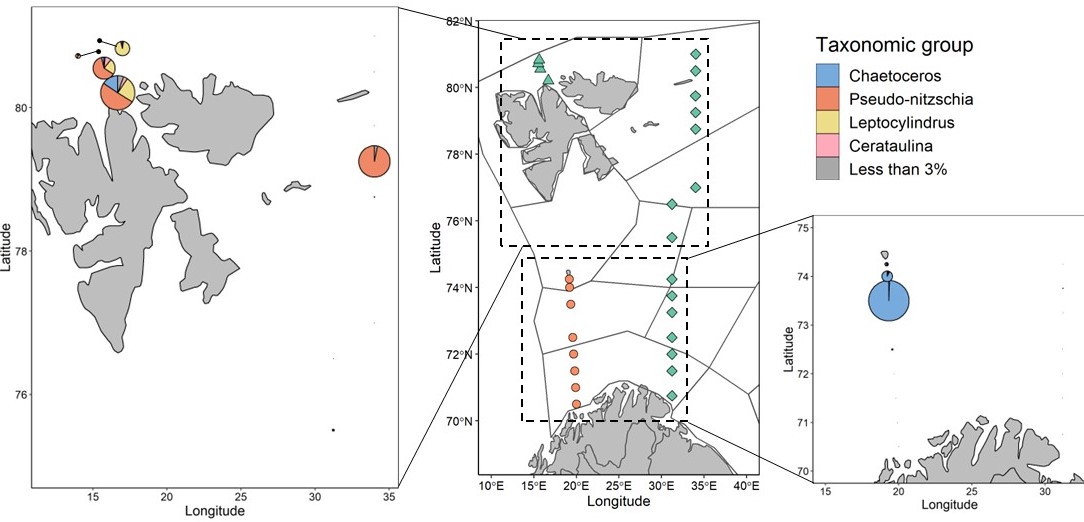
Figure 5.1.6. Maps showing diatom community composition and abundance at all sampled stations North of 75°N (left) and South of 75°N (right). Pie chart radii scale to average cell concentrations, scaling varies between panels to allow for visualization; maximum radii represent 1.44×10⁵ cells ml-1 (N of 75°N) and 8.63×10⁵ cells ml-1 (S of 75°N). Divisions within pie charts show the contributions from broad taxonomic groups. All groups which comprised ≤ 3% of the community at a given station are summed for ease of visualization. If pie charts were shifted for visualization, lines with points indicate original sampling location.